The market position overview reflects the distribution of the cost bases for circulation stocks across different price ranges. Observing the concentration and distribution of positions can provide insights into stock price trends, support and resistance areas, and potential future upward or downward movements.
1. Concept of the market position overview
The market position overview refers to the distribution of cost bases for circulation stocks and reflects the number of stocks held by investors at different price levels. Observing the market position overview for each trading day provides a complete understanding of the trading status of circulation stocks, which further aids in analyzing stock price trends. First, the market position overview can be used to determine whether a trend is likely to continue. In an upward trend, if a position moves up alongside the rising price, and the stock price is at or slightly above the average cost, it indicates that bullish sentiment is spreading, with increasing numbers of investors willing to buy the sold stocks. This suggests that the upward trend is likely to persist. The same logic applies to a downward trend. Furthermore, the concentration degree of positions above and below the price can be used to assess the future movement of the stock price. If there is a significant concentration of positions above the current stock price, the stock is likely to encounter sell-off pressure from loss-making positions during the upward movement of the stock price, making it difficult for the stock price to climb higher. To overcome this resistance, a substantial increase in volume is typically necessary during the upward push. Conversely, if a large concentration of positions is mainly situated below the current stock price, there is less resistance during the upward movement of the stock price, making it easier for the stock price to climb high.
2. The market position overview chart
Click the market position overview icon in the upper right corner of the stock details page, where the market position overview for the last trading day is displayed by default; drag the K-line to view the market position overviews for different trading days.
3. Understand market position overview indicators (using red for gains and green for losses as an example)
The red position area represents profitable positions, where the cost bases for these positions are below the current price;
The green position area represents loss-making positions, where the cost bases for these positions are above the current price;
The yellow line indicates the average cost of all positions;
Resistance refers to points where the stock price is likely to face resistance during its upward movement;
Support refers to points where the stock price is likely to find support during its downward movement.
4. Application of the market position overview
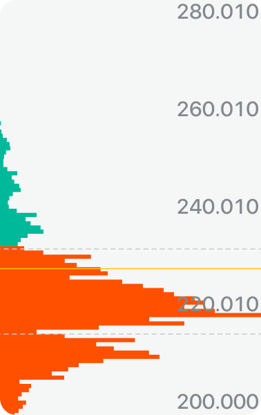
(1) Low-level concentration
This pattern occurs after a stock price has continuously declined or remained in a sideways movement at a low level. At this point, positions from higher levels are transferred to lower levels. If these lower-level positions are concentrated within a narrow price range and the proportion of profitable positions is significant, a low-level concentration pattern is established. In this situation, the resistance to upward stock price movement diminishes, indicating a strong possibility of a bottom forming and the potential for a rally to occur.
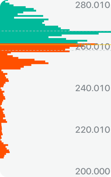
(2) High-level concentration
This pattern occurs after a stock price has continuously risen or remained in a sideways movement at a high level. At this point, positions from lower levels are transferred to higher levels. If these higher-level positions are concentrated within a narrow price range and the proportion of profitable positions is small, a high-level concentration pattern is established. In this situation, the resistance to upward stock price movement is significant, and if the price continues to rise, it will encounter sell-off pressure from loss-making positions. Therefore, the primary strategy should be to avoid this situation.
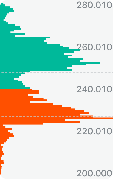
(3) Double-peak pattern
This refers to the formation of two concentration peaks in the market position overview chart, with the stock price situated between these two concentration areas. When the stock price moves downward, it encounters support from the lower concentration area, and when it moves upward, it faces sell-off resistance from the upper concentration area. At this time, the stock price tends to fluctuate.
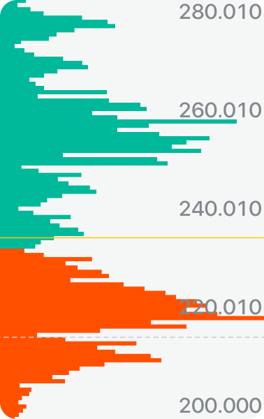
(4) Position divergence
This refers to a scenario where the corresponding price levels of positions are highly dispersed. This indicates that the current positions are very fragmented and not concentrated in the hands of influential players, resulting in a lack of market cohesion. Consequently, the stock price is unlikely to experience a sharp rise. This pattern is commonly seen in large-cap stocks.
Key Takeaways: The market position overview reflects the cost bases for different price levels, aiding in the assessment of market sentiment and trend direction. An upward movement of positions indicates bullish sentiment, while a downward movement suggests bearish sentiment; high-level concentration acts as resistance, while low-level concentration serves as support. Click the individual stock detail page in the upper right corner to view the market position overview chart, and move the K-line to check historical overviews. Combining this with the average cost line and concentration areas helps determine trading opportunities.
Disclosures
The above analysis reflects general trends and does not guarantee market outcomes; it does not constitute any investment advice.
- Business / KOL Partnership
- nz@longbridge.global
- Public Relations
- nz@longbridge.global
- Terms and Conditions
- Customer Agreement
- Privacy Policy
- Risk Disclosure
- Disclaimer
- Disclosure Statement

A New Zealand registered Financial Service Provider (FSP number: FSP600050), and is a member of the Financial Dispute Resolution Scheme, a New Zealand independent dispute resolution service provider.

A licensed corporation recognized by the SFC (CE No. BPX066). Holder of License Types 1 (Dealing in Securities), 2 (Dealing in Futures Contracts), 4 (Advising on Securities) and 9 (Asset Management). Also a registered HKEX participant and HKSCC participant.

Registered with the Monetary Authority of Singapore (MAS), Long Bridge Securities Pte. Ltd. is a Capital Markets Services Licence holder and Exempt Financial Adviser (Licence No. CMS101211).

A broker dealer registered with the Securities and Exchange Commission (SEC)(CRD: 314519/SEC: 8-70711), a member of the Financial Industry Regulatory Authority (FINRA) and Securities Investor Protection Corporation (SIPC).